Mastercard rebrand
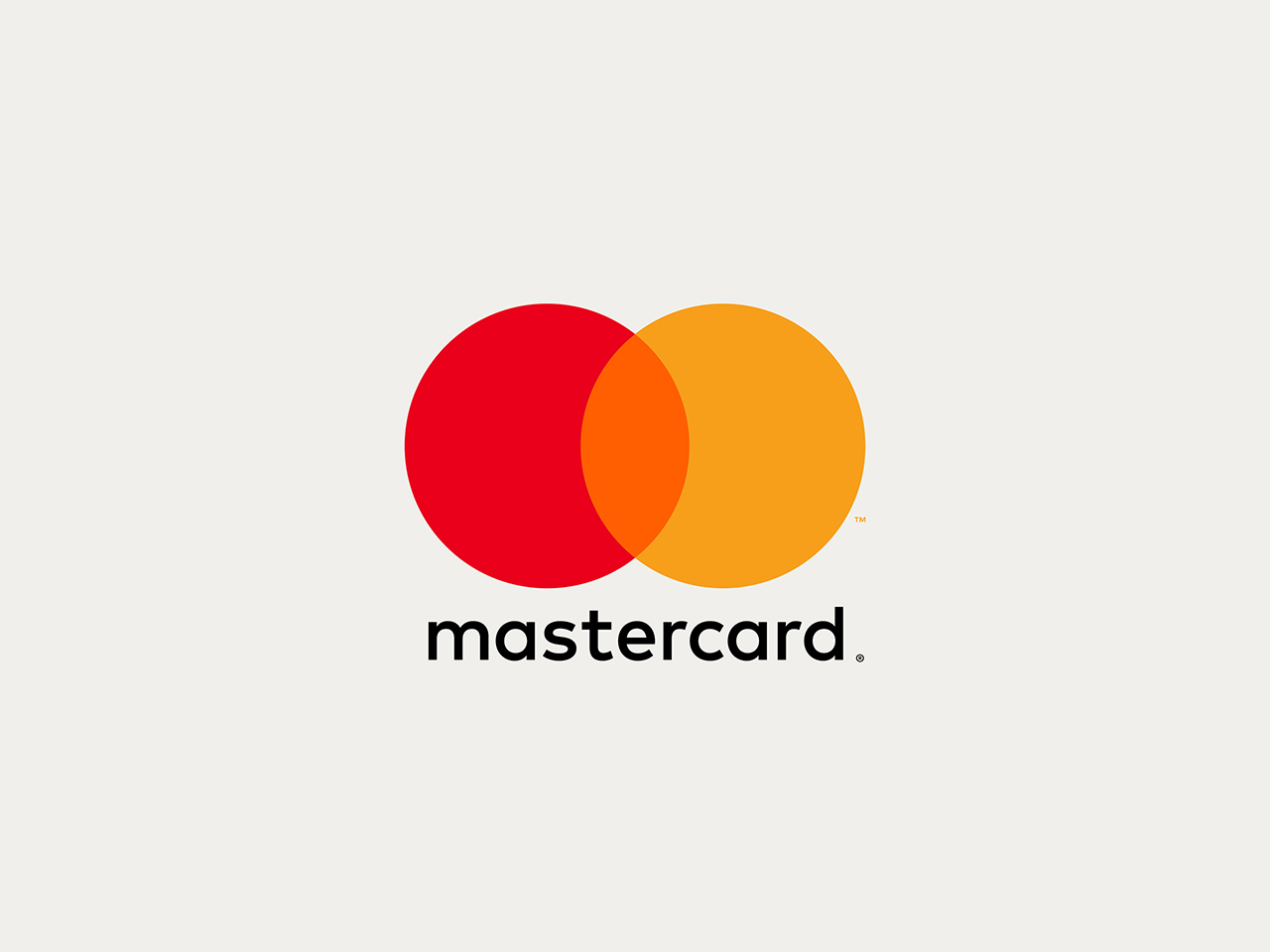
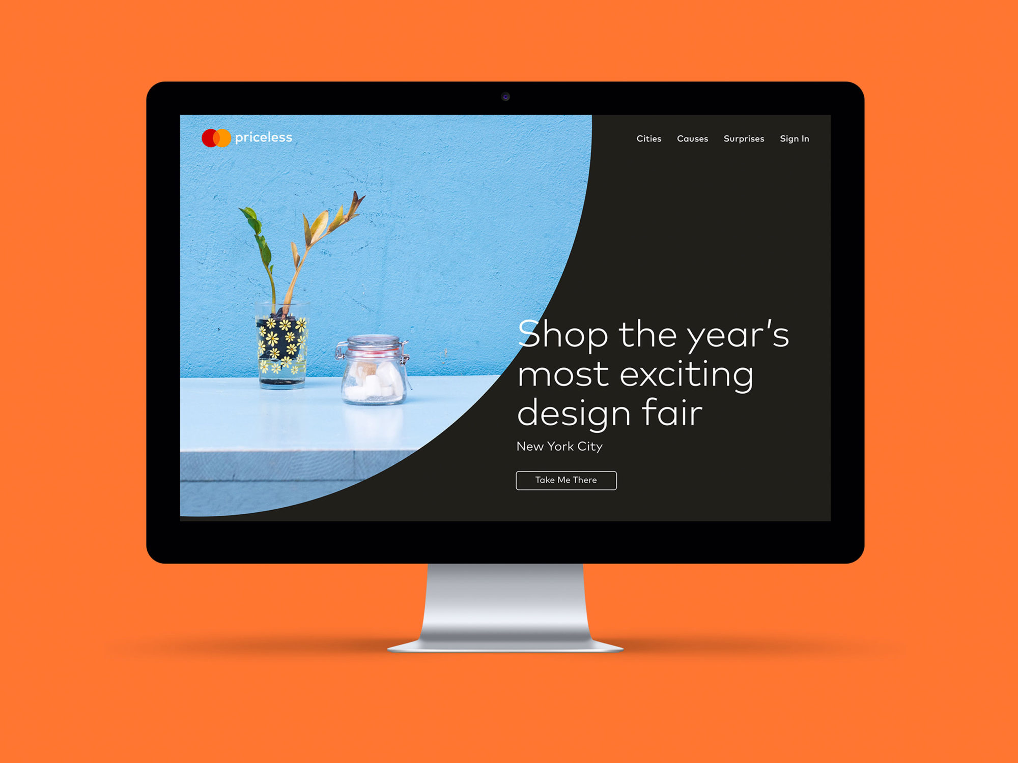
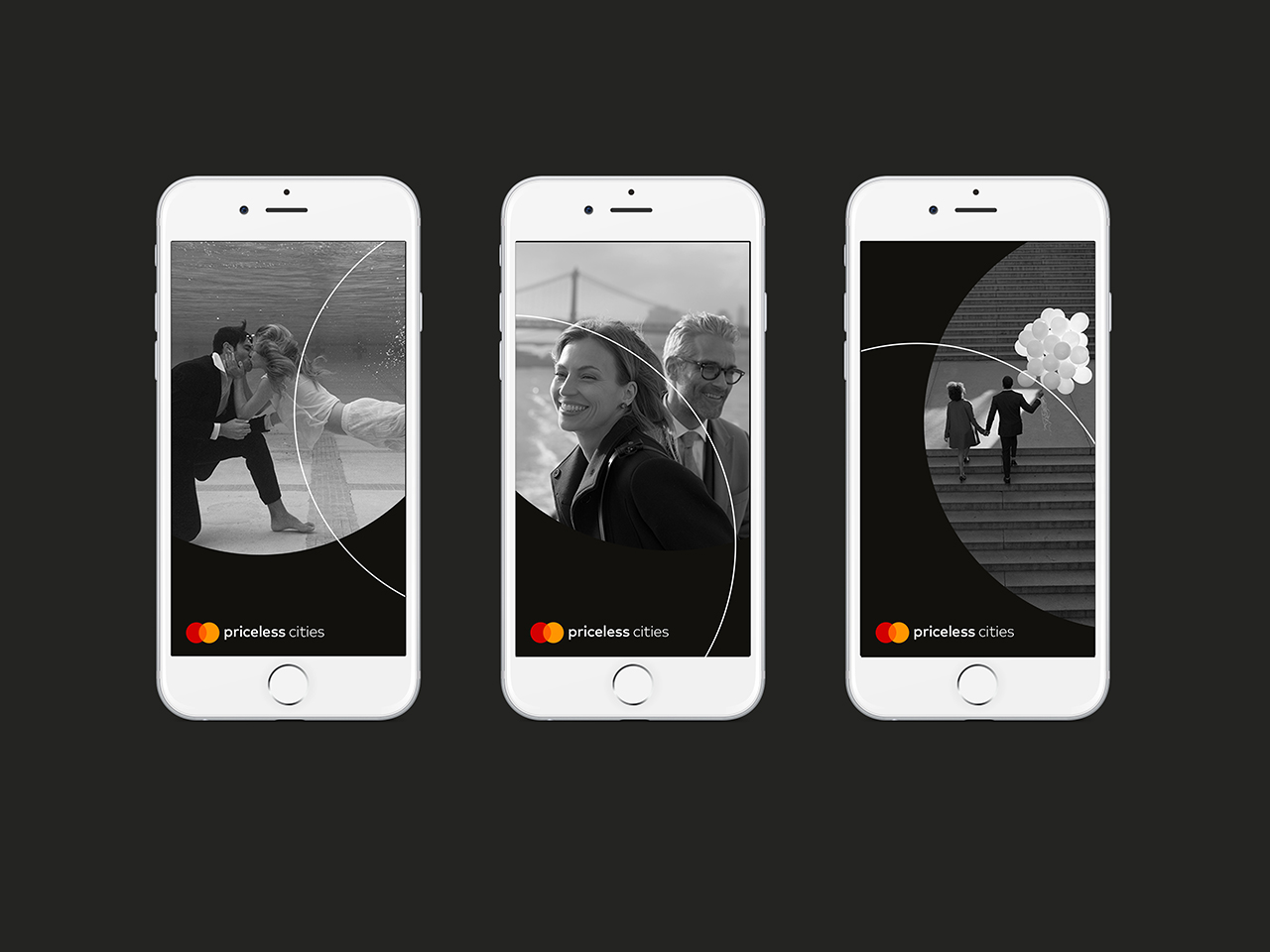
An evolution of the brand emphasizes simplicity, connectivity and seamlessness. The identity brings simplicity and clarity with an increased emphasis on the interlocking circles, and is optimised for use in digital contexts, an increasingly important part of Mastercard’s business.
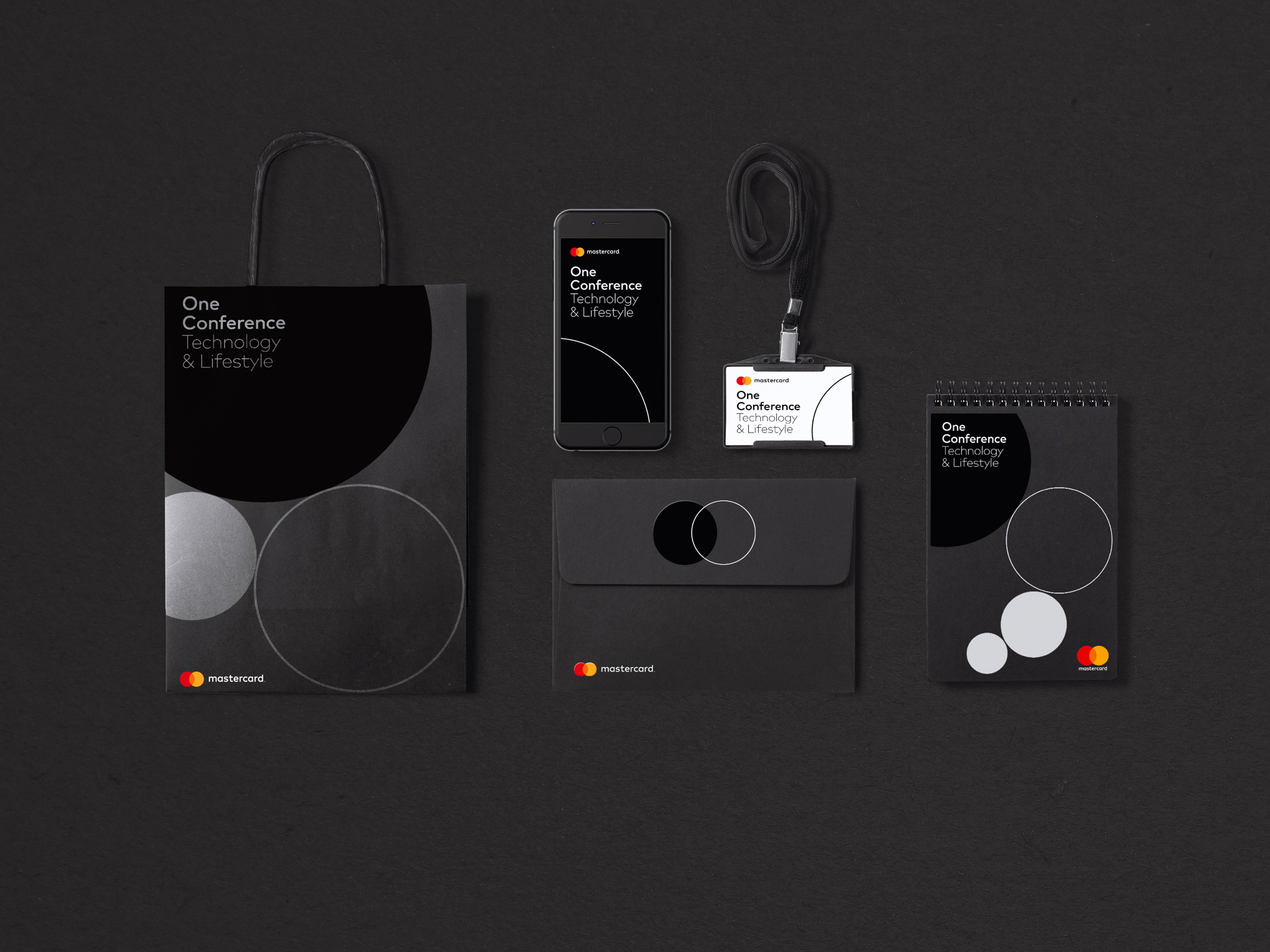
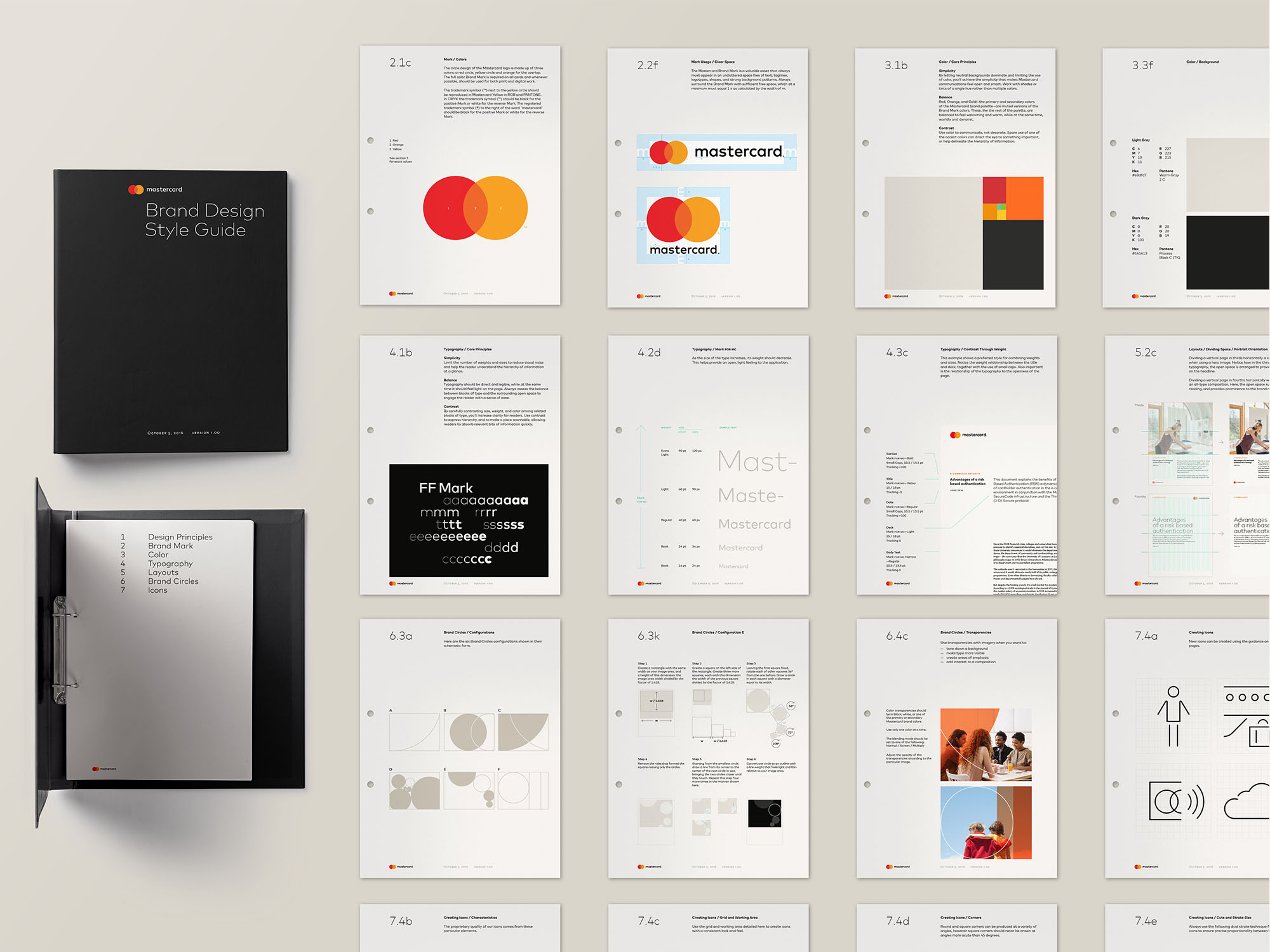
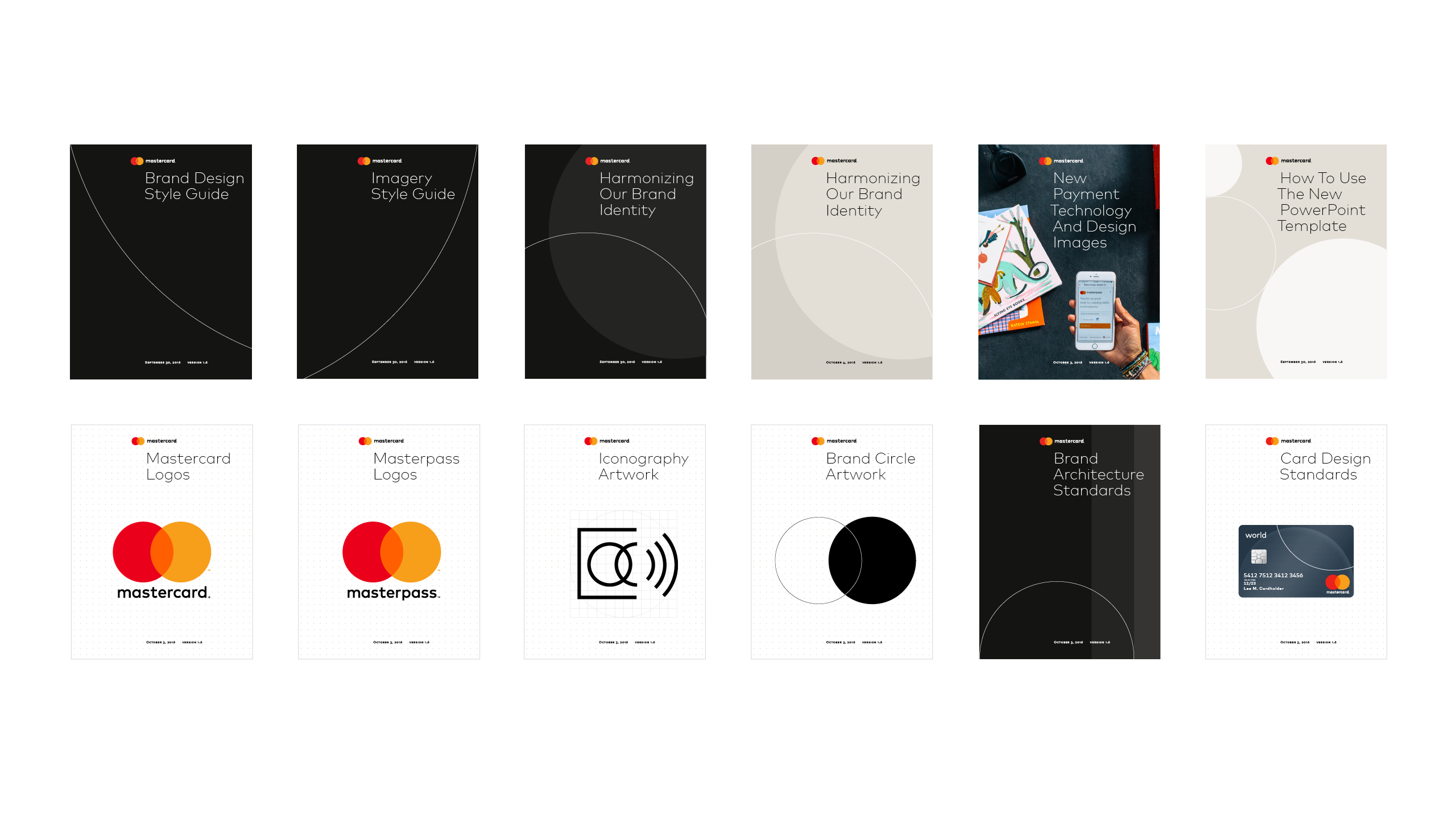
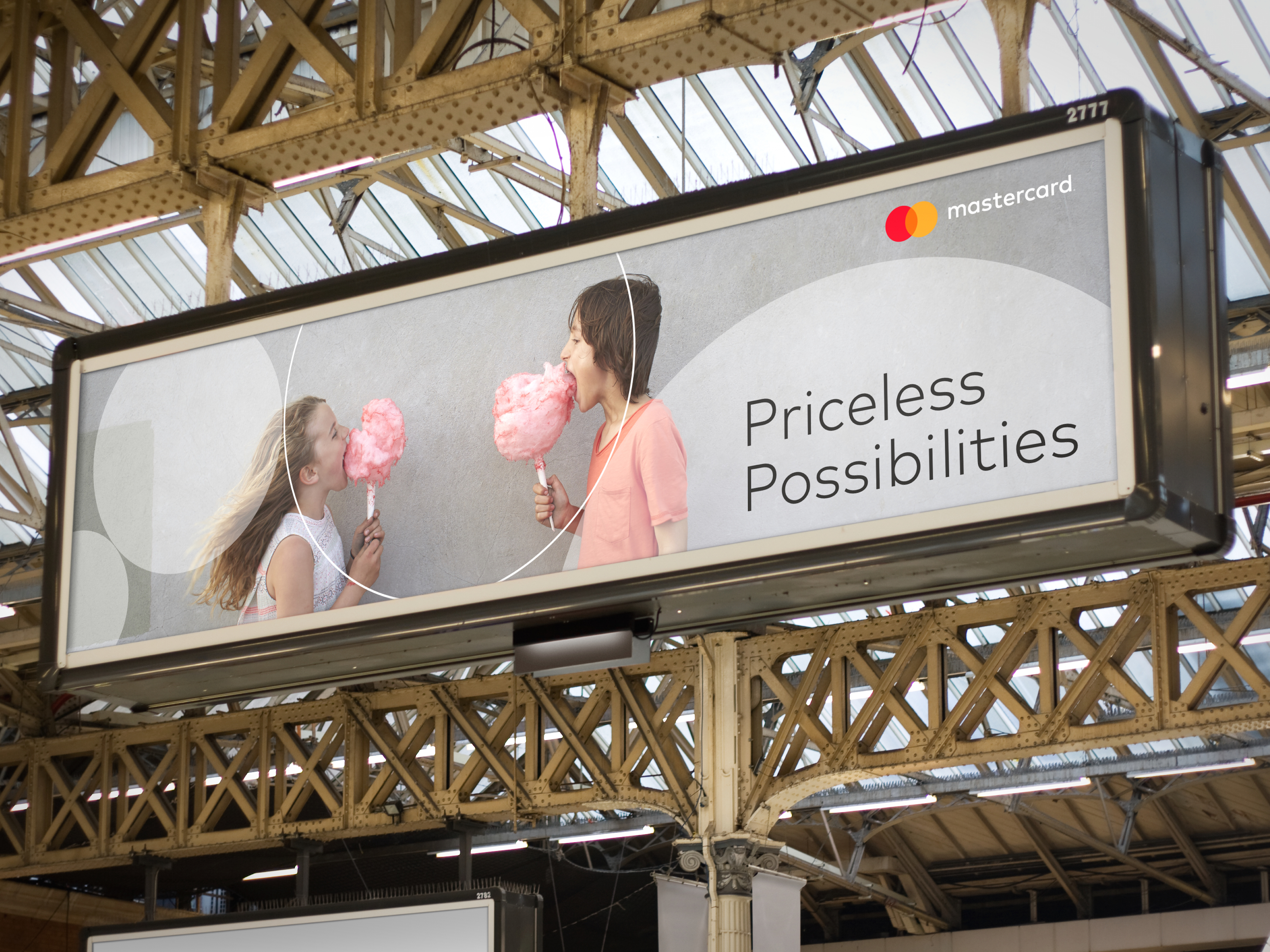
The entire identity is built using the core elements found in the logo: geometry and colour. A new set of graphic tools have been developed to help Mastercard communicate effectively and concisely in all media. The tools consist of a distinctive colour palette, a new typographic system, and pure graphic shapes with parameters that enable the creation of an infinite series of varied yet connected graphic patterns. In addition, custom icon sets, illustrations and photographic styles have been established to create a consistent visual system to express a wide range of messages.
In applications, the graphic elements complement the typography and are built parametically around mathematical principles found in the mark. Coupled with the power of computing, the parametric design generates infinite arrangements, each different from the next, though all part of the same visual system.
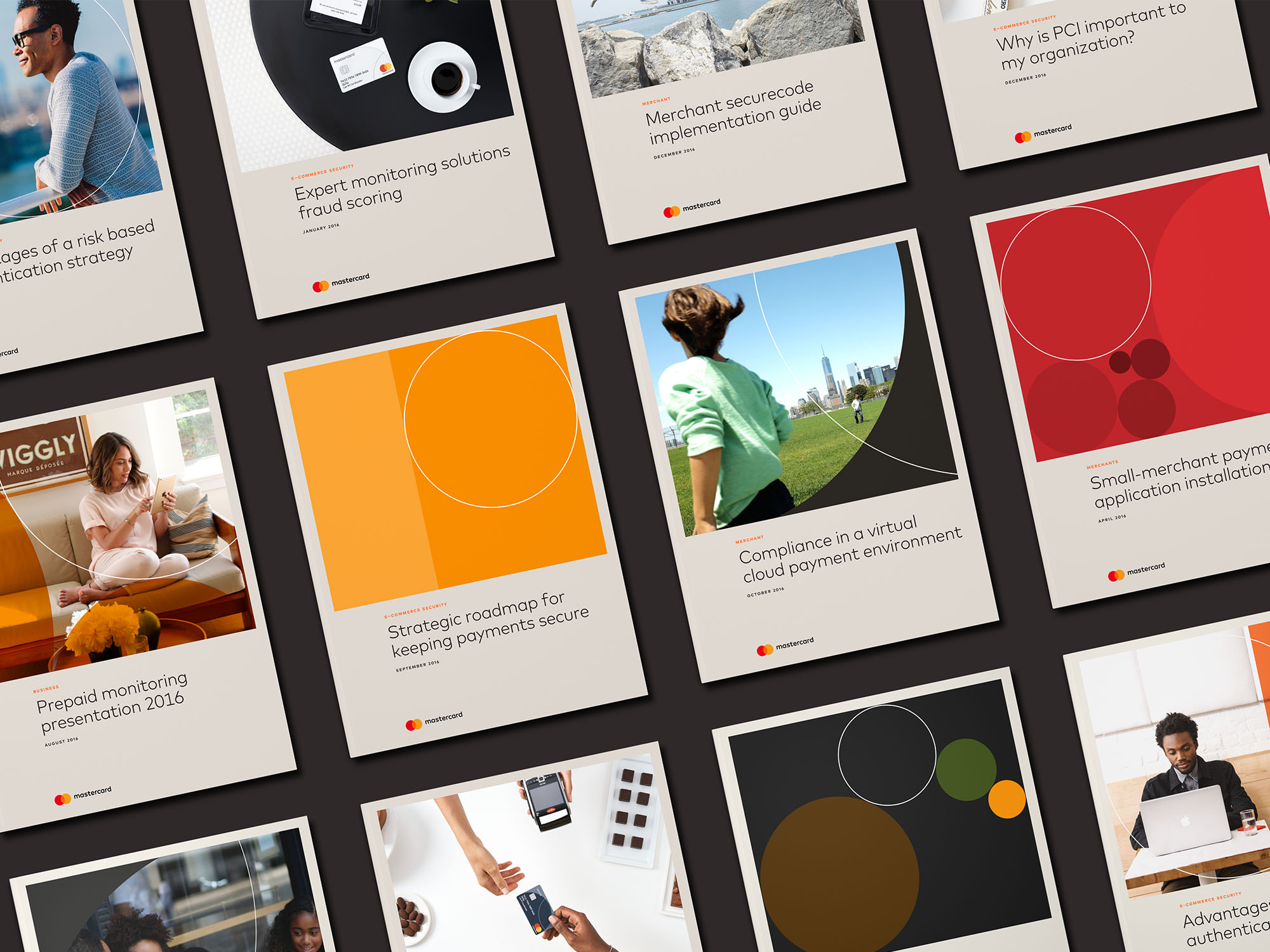


 Partners-in-Charge: Michael Bierut & Luke Hayman
Associate, Designer: Hamish Smyth
Designers: Andrea Trabucco-Campos, Eli Hochberg